Work type: Branding, Visual Identity, Logotype
Client: THE SPAACE

Introducing THE SPAACE, the official online partner of ART HAUS, ARTIFACTS and ASPORT. Showcasing a curated edit of the best international luxury and emerging fashion brands, THE SPAACE aims to create an immersive 360-degree environment for our discerning customer, spanning across luxury and lifestyle, and designed with storytelling at its core.
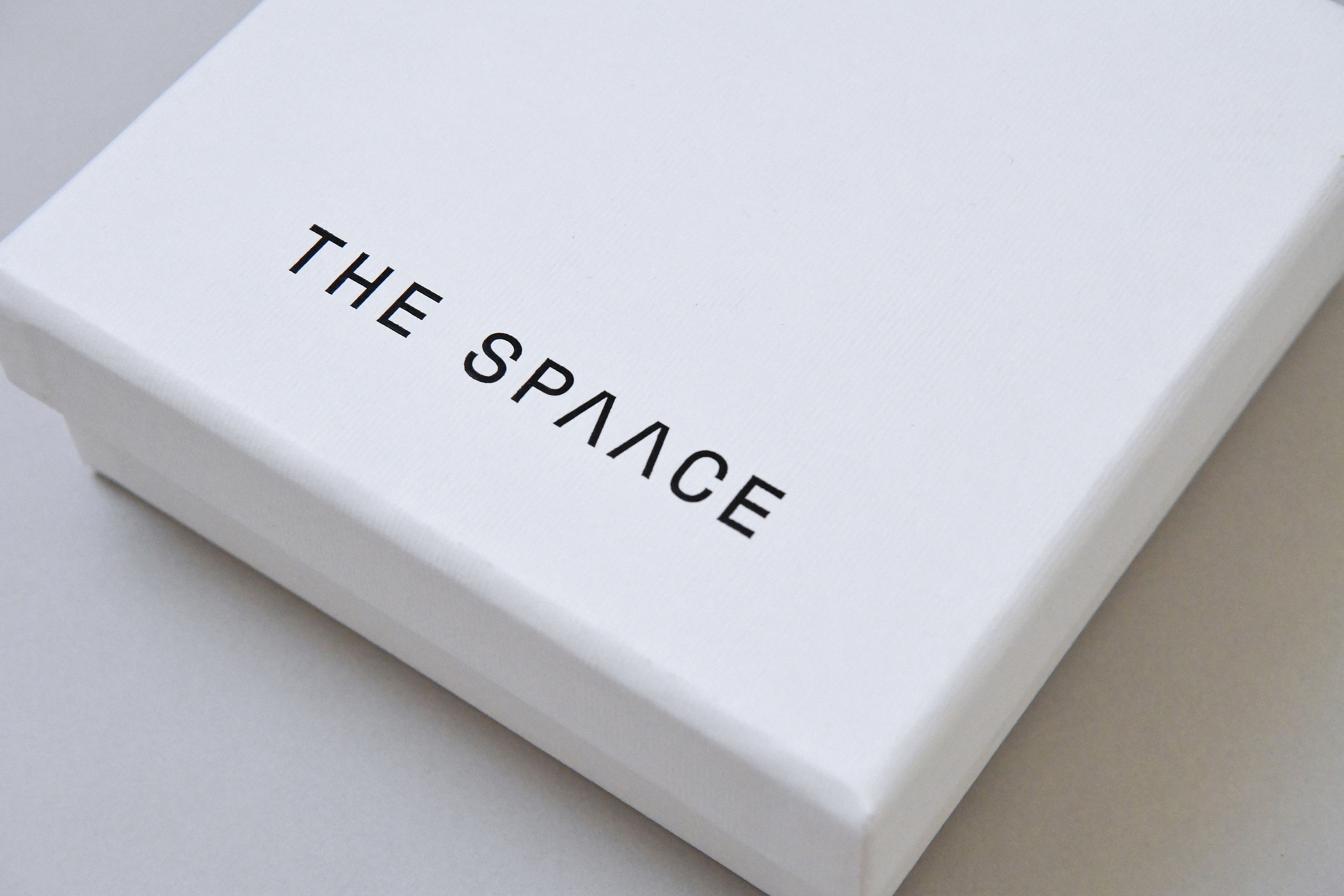
We designed a comprehensive visual identity for the brand, encompassing logotype design, packaging applications, and website design. The concept behind the logo design aims to evoke a modern and minimalist sense while emphasizing the brand's concept of "space." To achieve this, we modified the shape of the double-letter "A" in the logo, removing the original straight lines to create an open negative space within the letter "A." This design also alludes to imagery like caves and tunnels.
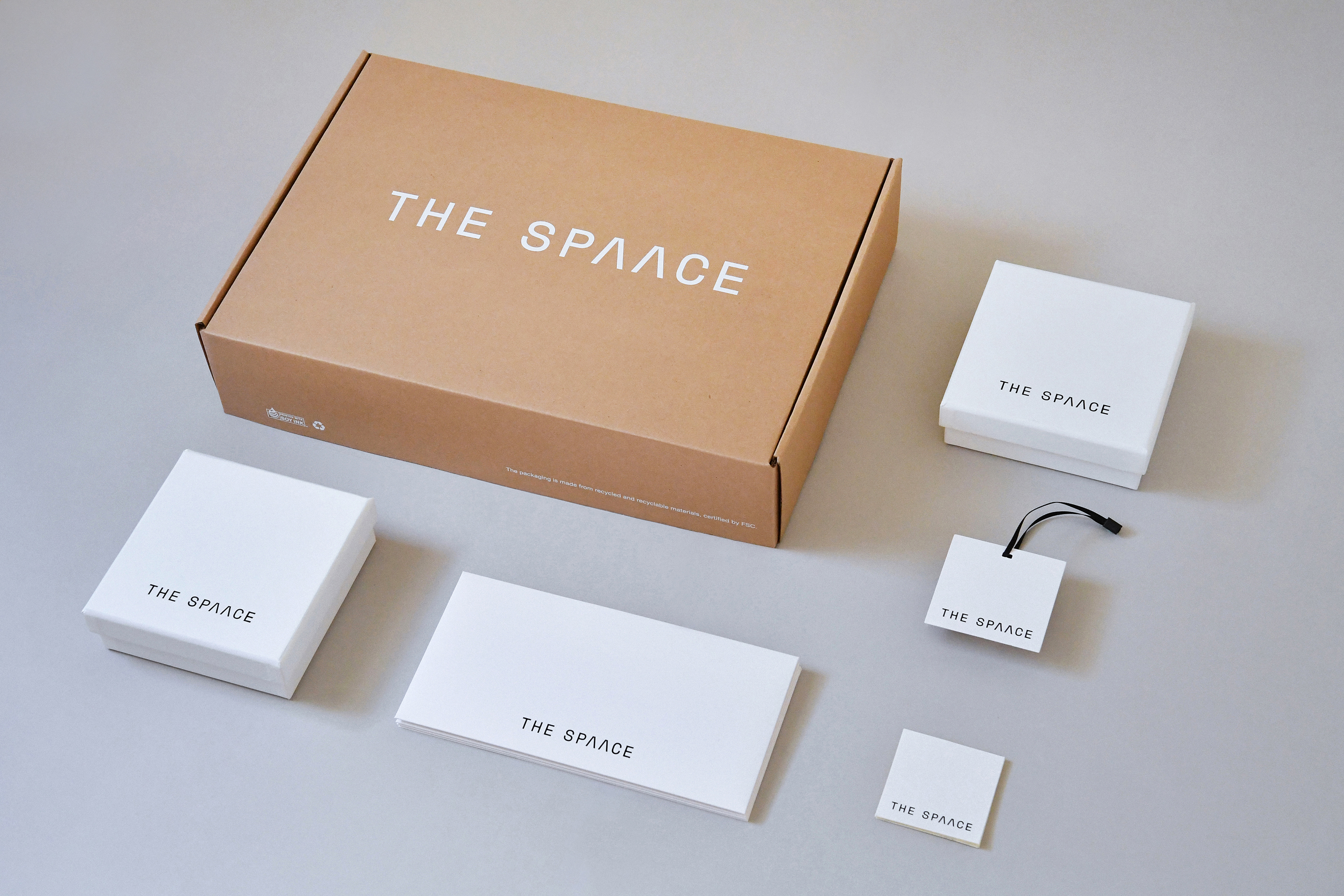
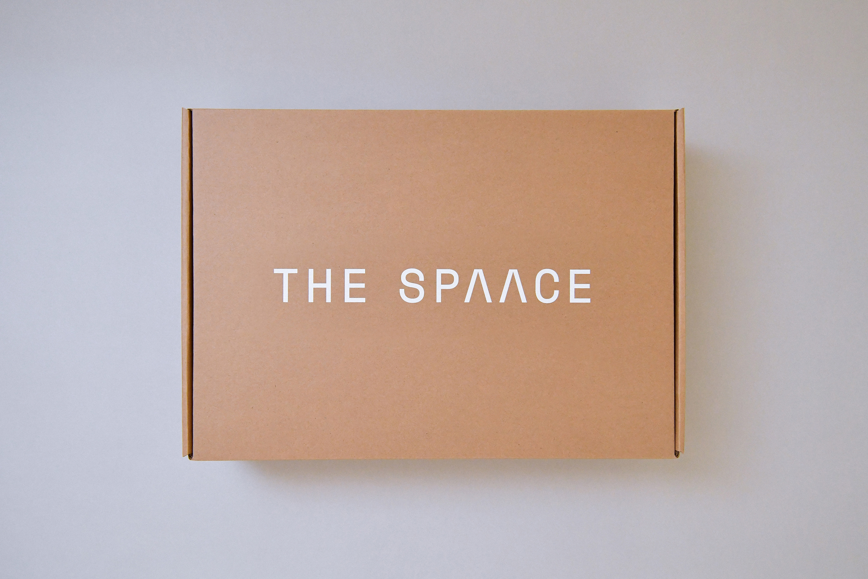
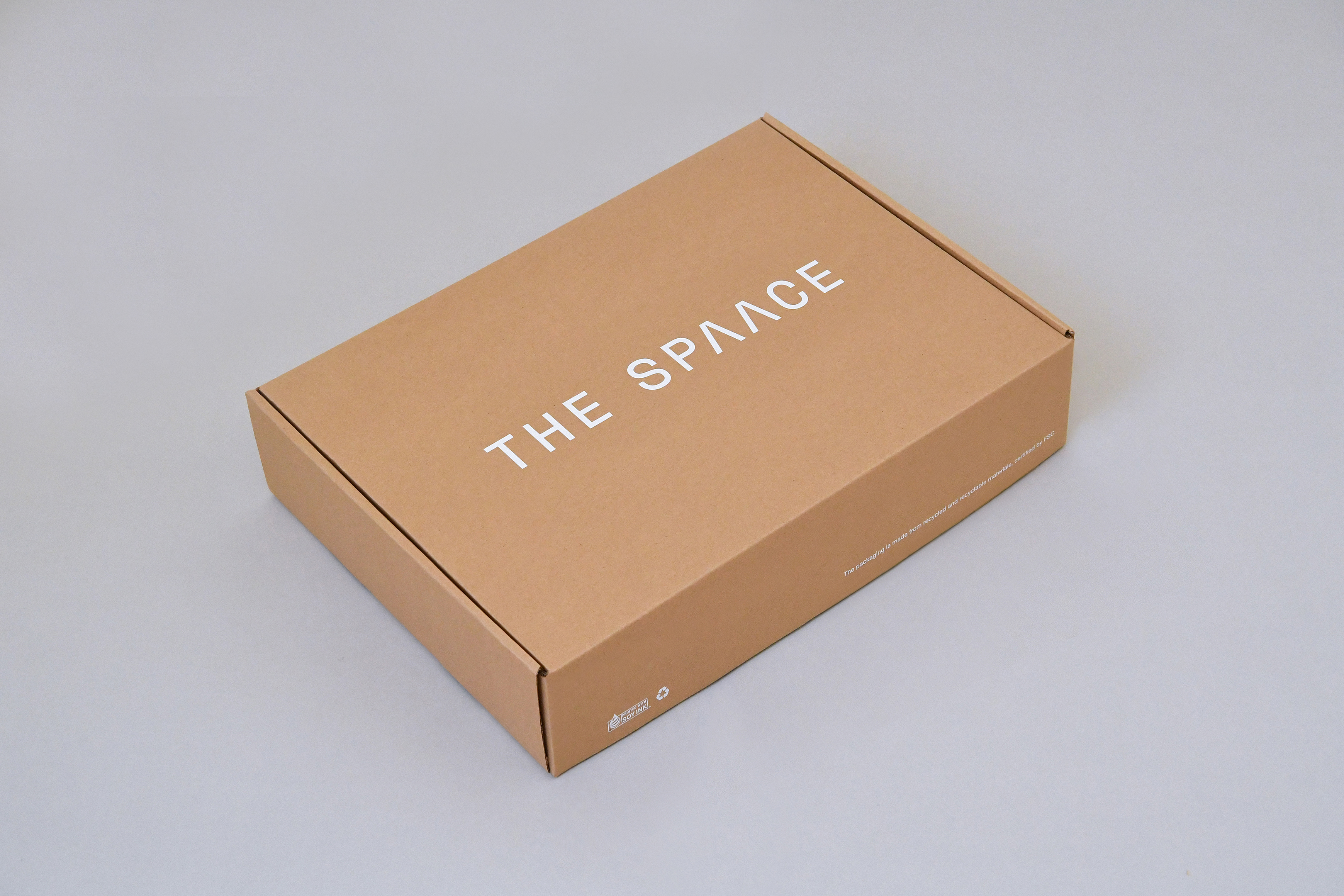
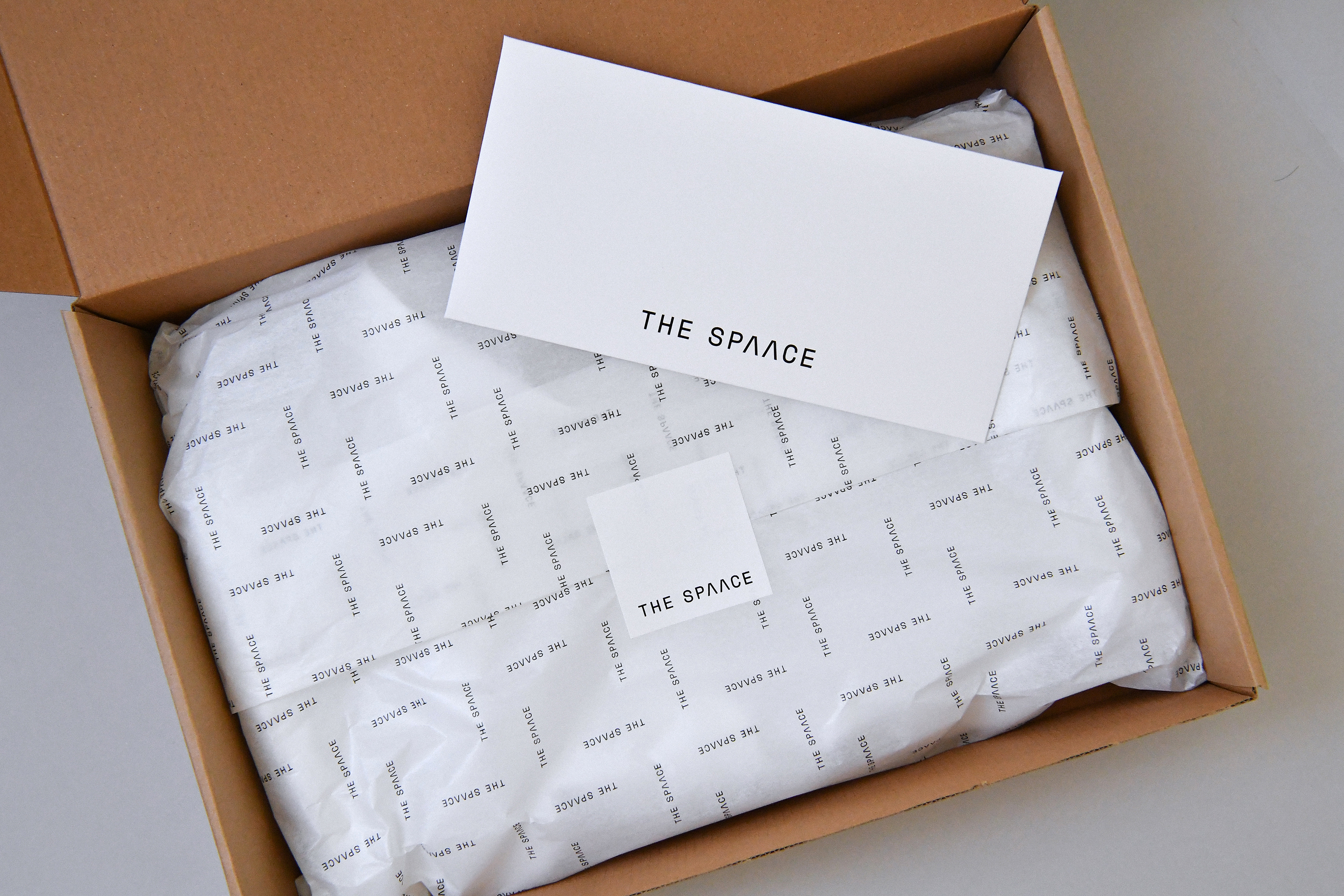
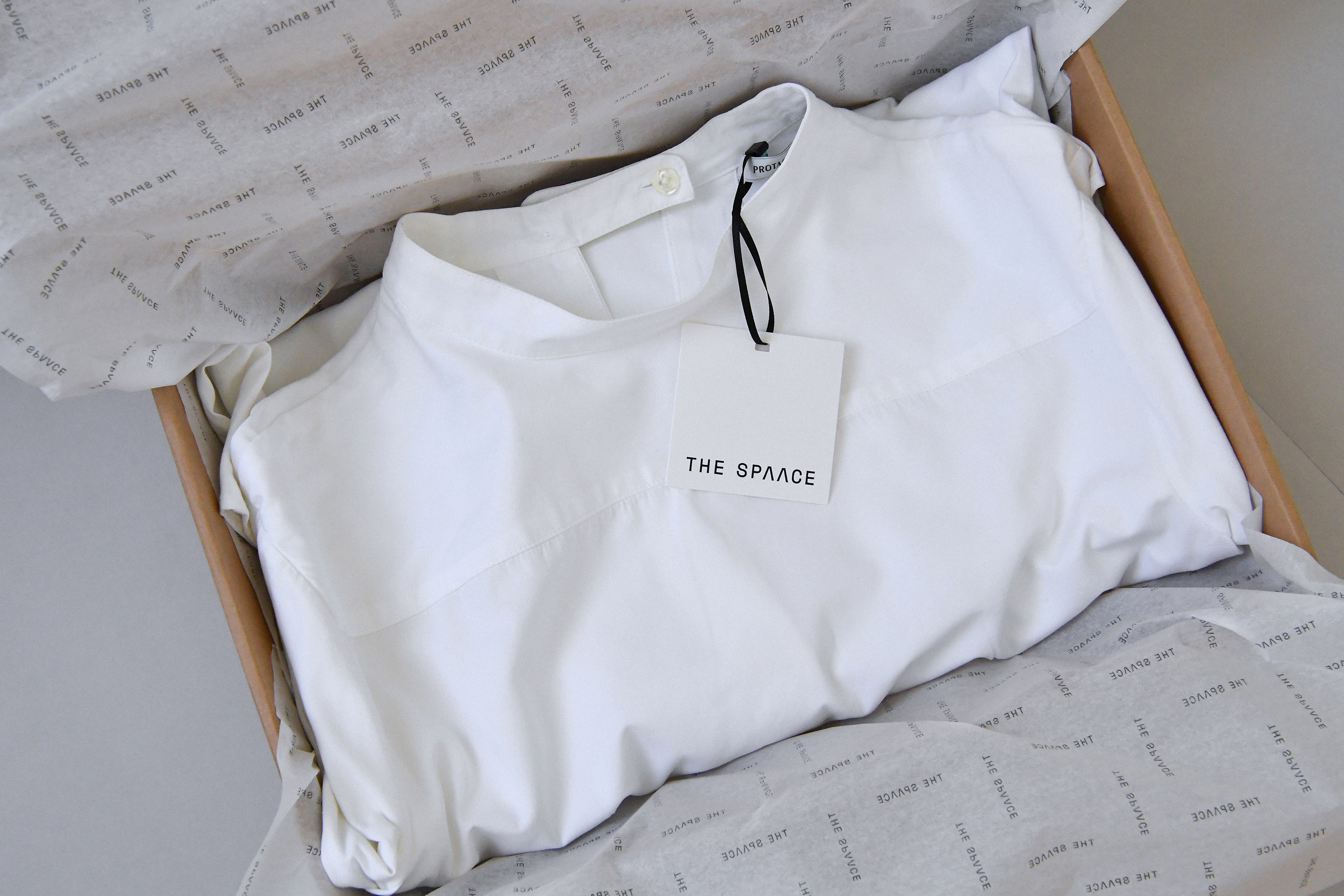
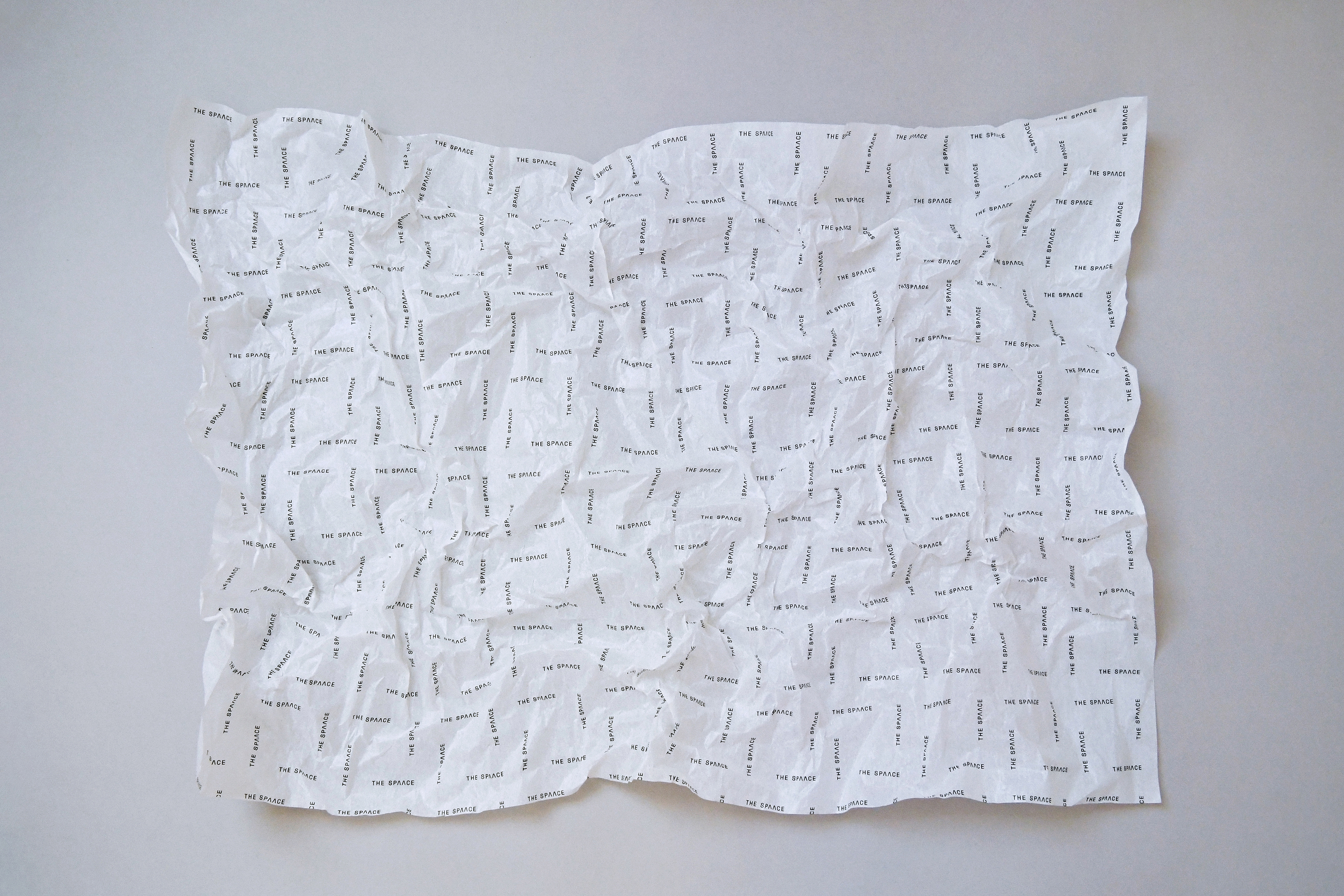
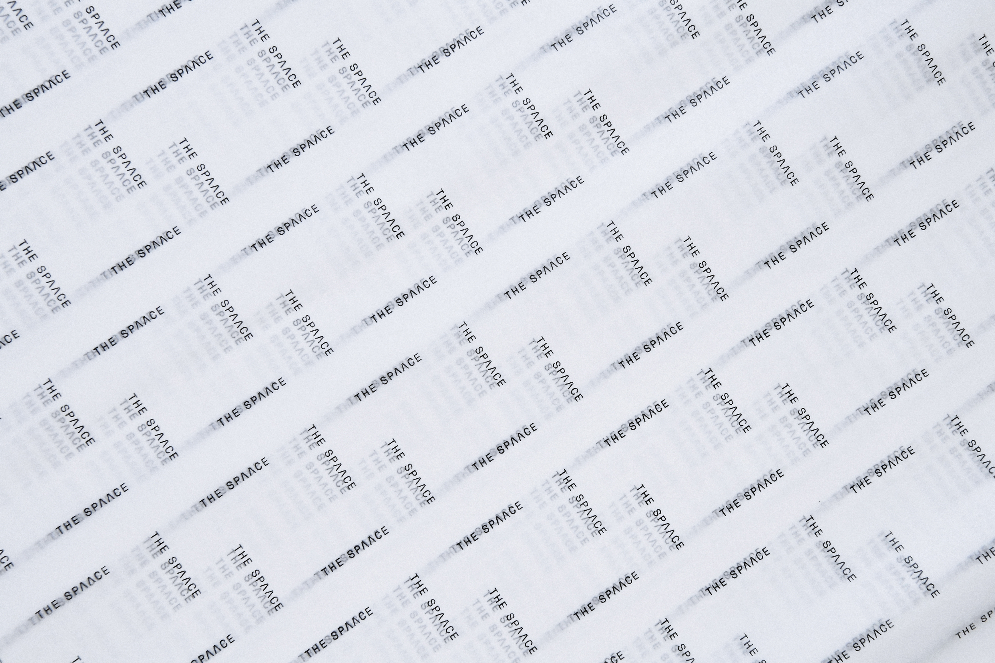
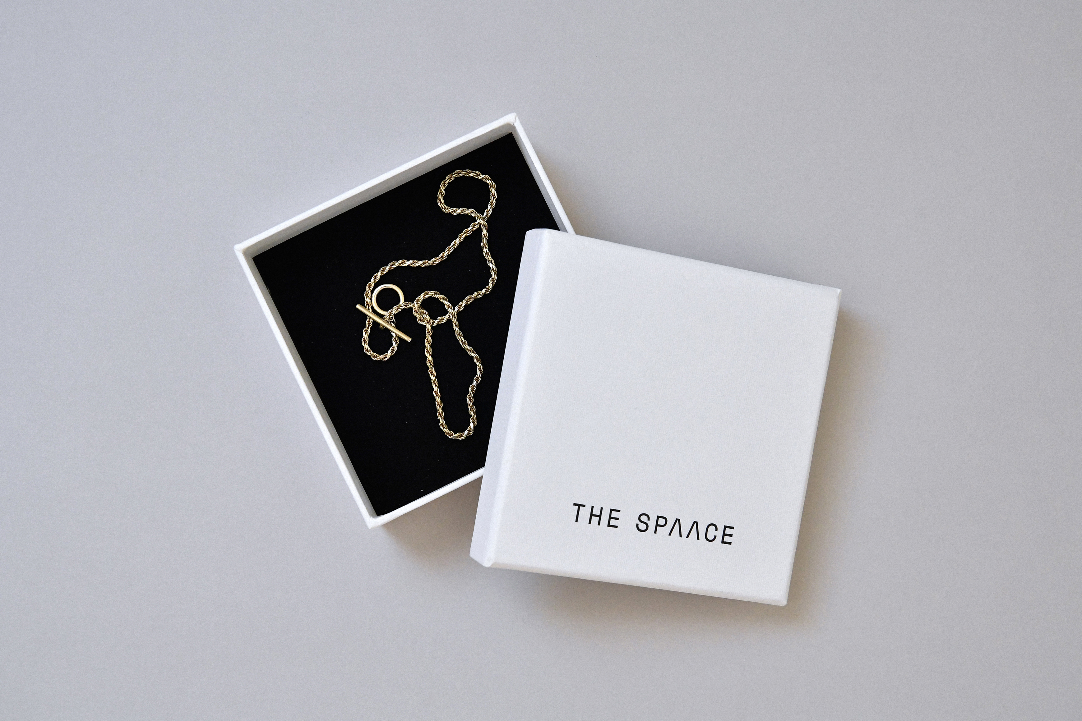
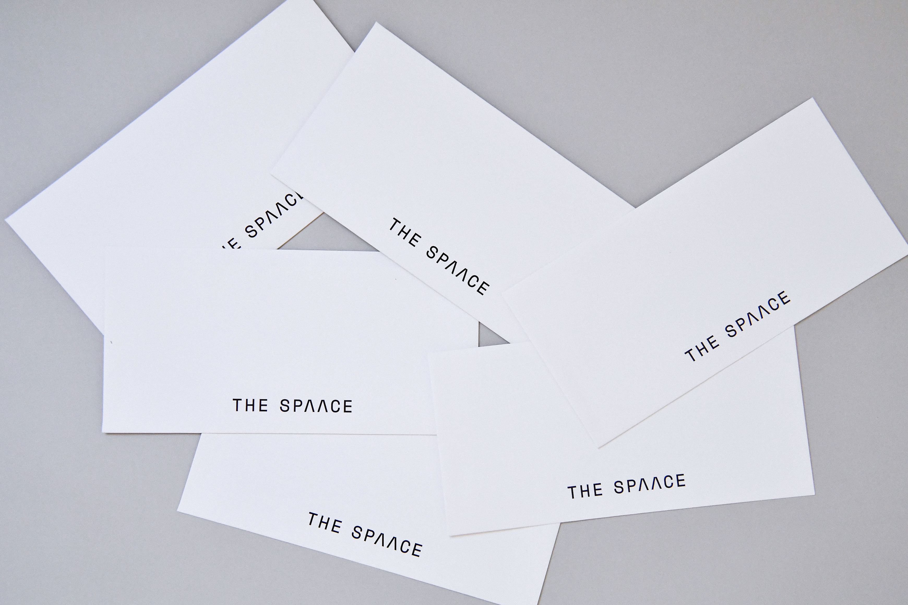
The packaging design includes a range of elements such as paper boxes, hang tags, invoice envelopes, wrapping paper, and jewelry boxes. Maintaining the minimal style, we chose neutral colors like white and black, or the original colors of the materials, to convey a simple yet warm feeling. For the wrapping paper, we specifically designed a pattern that extends from the logotype.
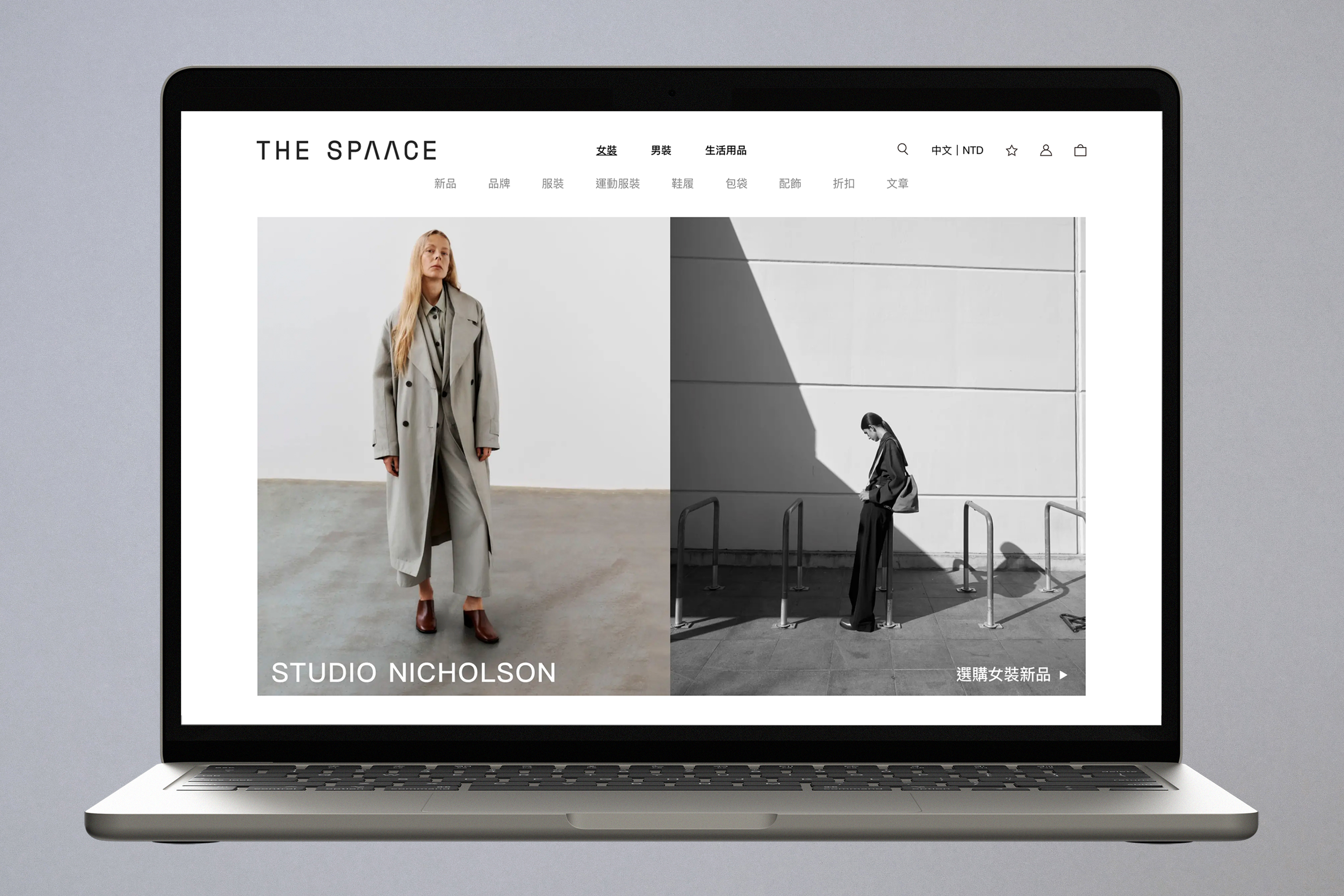
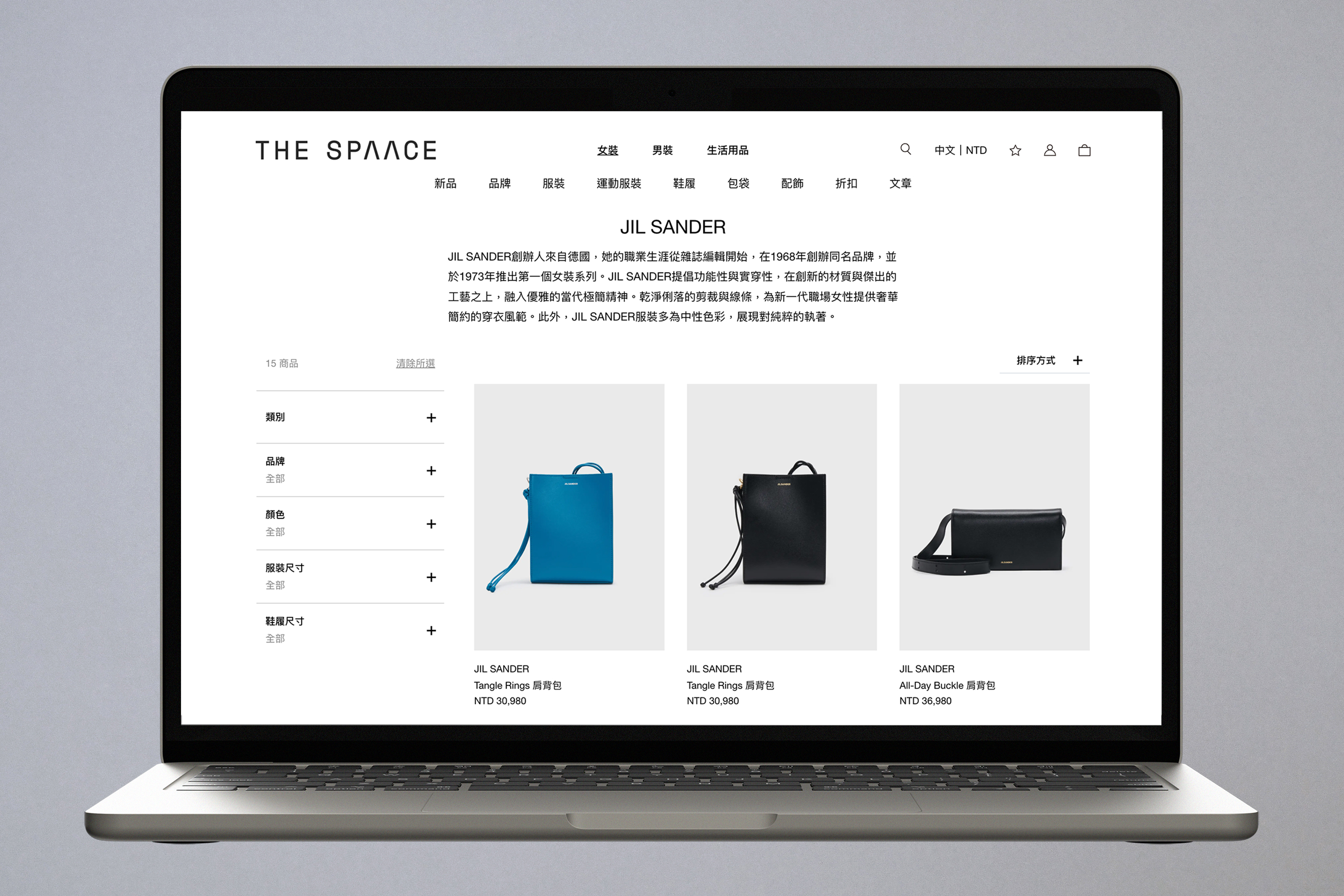
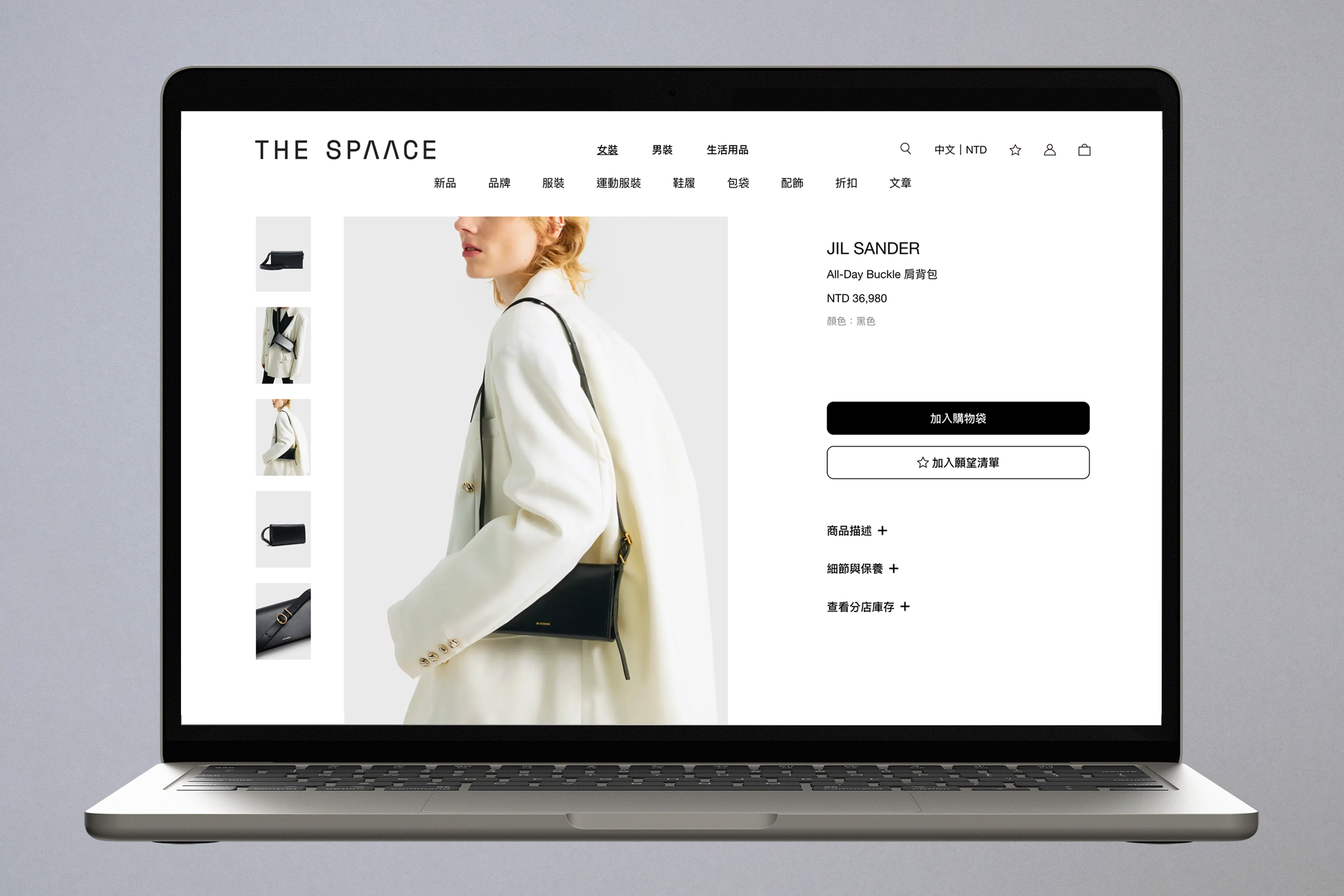
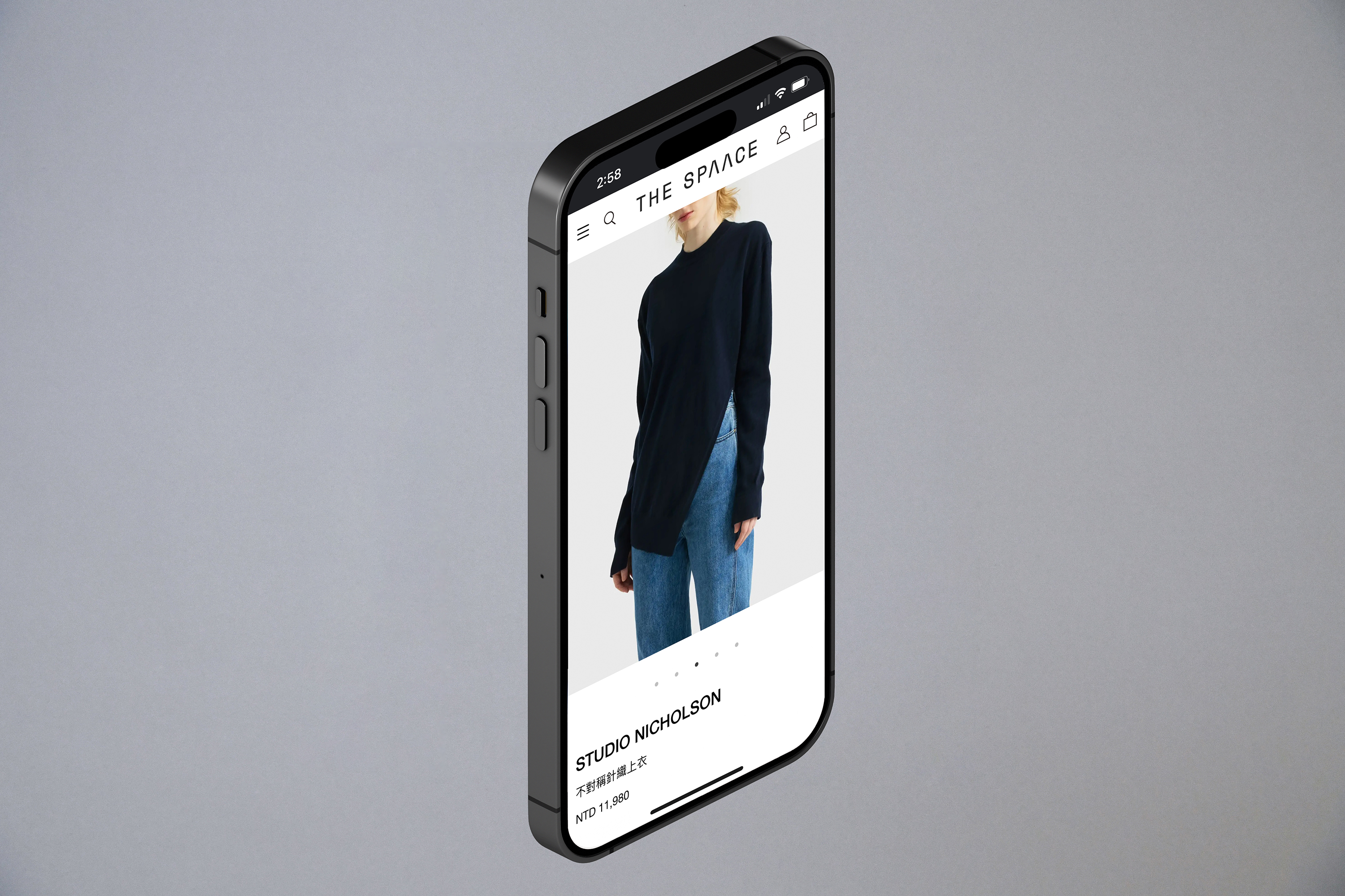
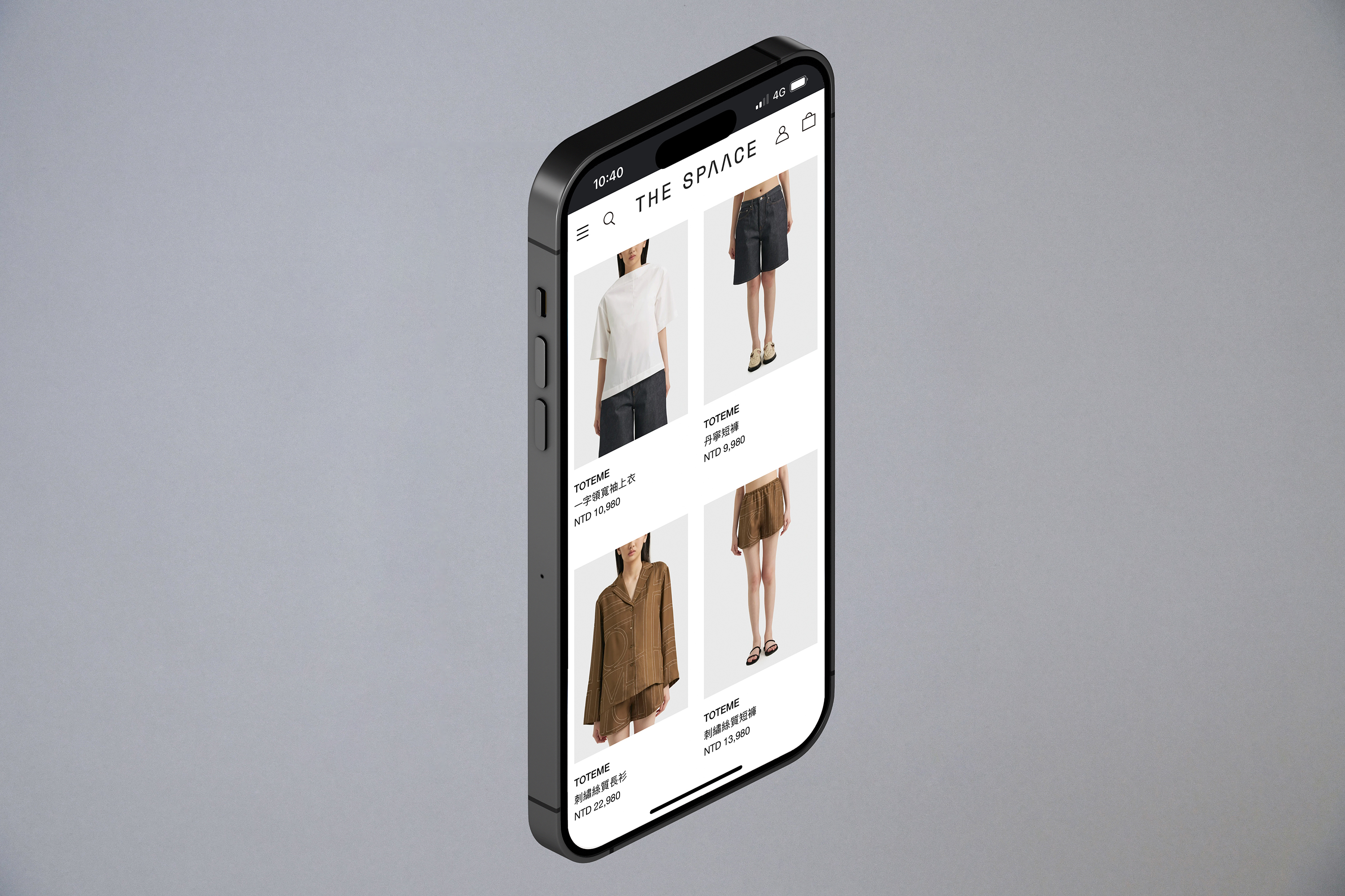
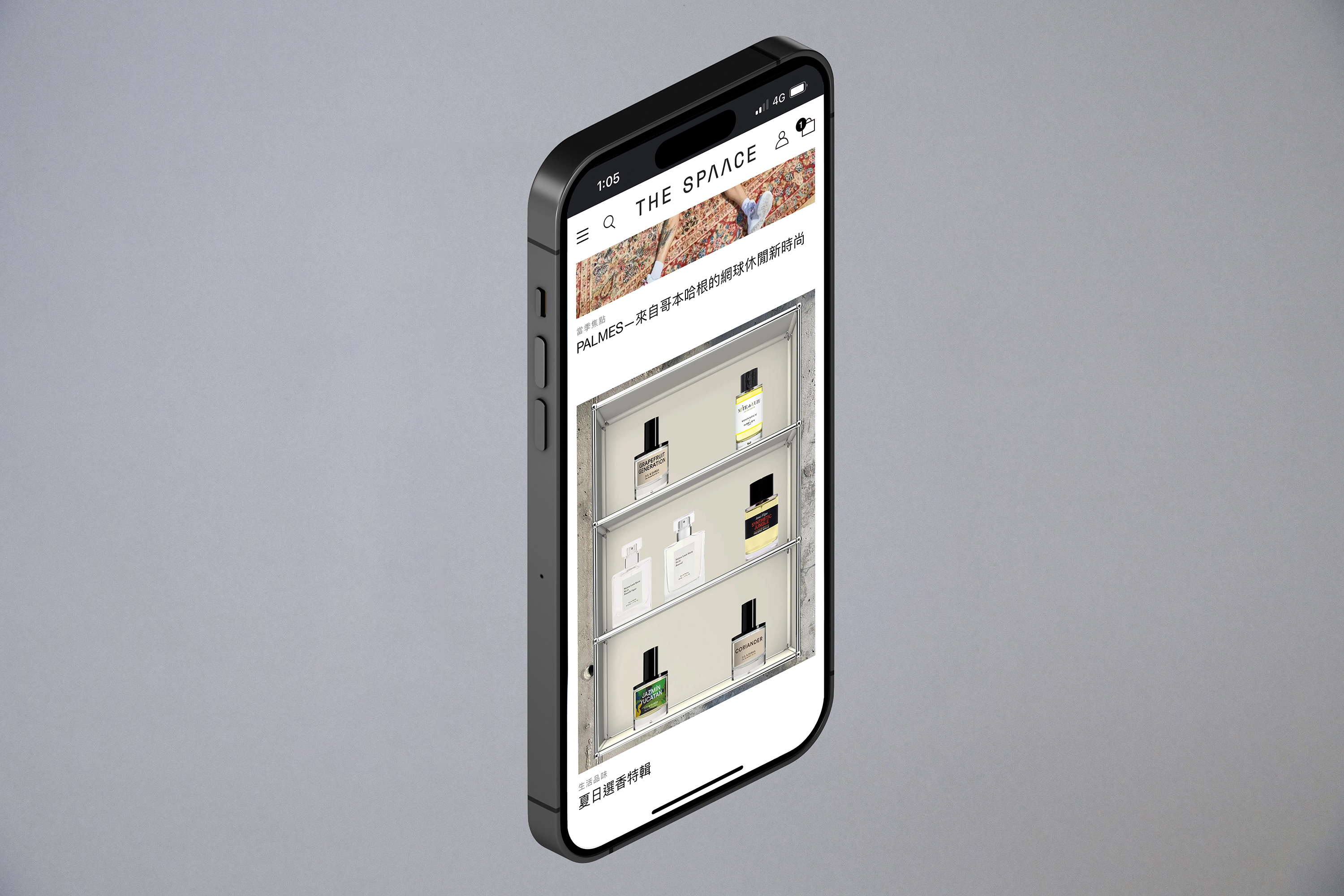
In taking the new identity online, we decided on a pared-back, confident approach that focuses on the platform’s grand selection of products while conveying a strict commitment to visual consistency.
THE SPAACE 以帶來高端生活體驗為目標,將各種風格、各有獨特性質的品牌整合成獨一無二的精品電商平台,打造出一個時尚生活圈,集合了各種時尚精品、藝術、設計與創意,從新銳設計師品牌到國際一線品牌。
我們為該品牌設計了一系列的品牌識別,從 LOGO 設計、包裝應用到網站設計。LOGO 的設計概念,希望帶出品牌現代簡約的簡潔感,並強調品牌本身對於「空間」的概念,因此從雙字母的 A 形體上去做修改,拿掉原本存在的直線,讓 A 字母本身呈現一個開放性的負空間,也暗喻洞穴、隧道等意象。
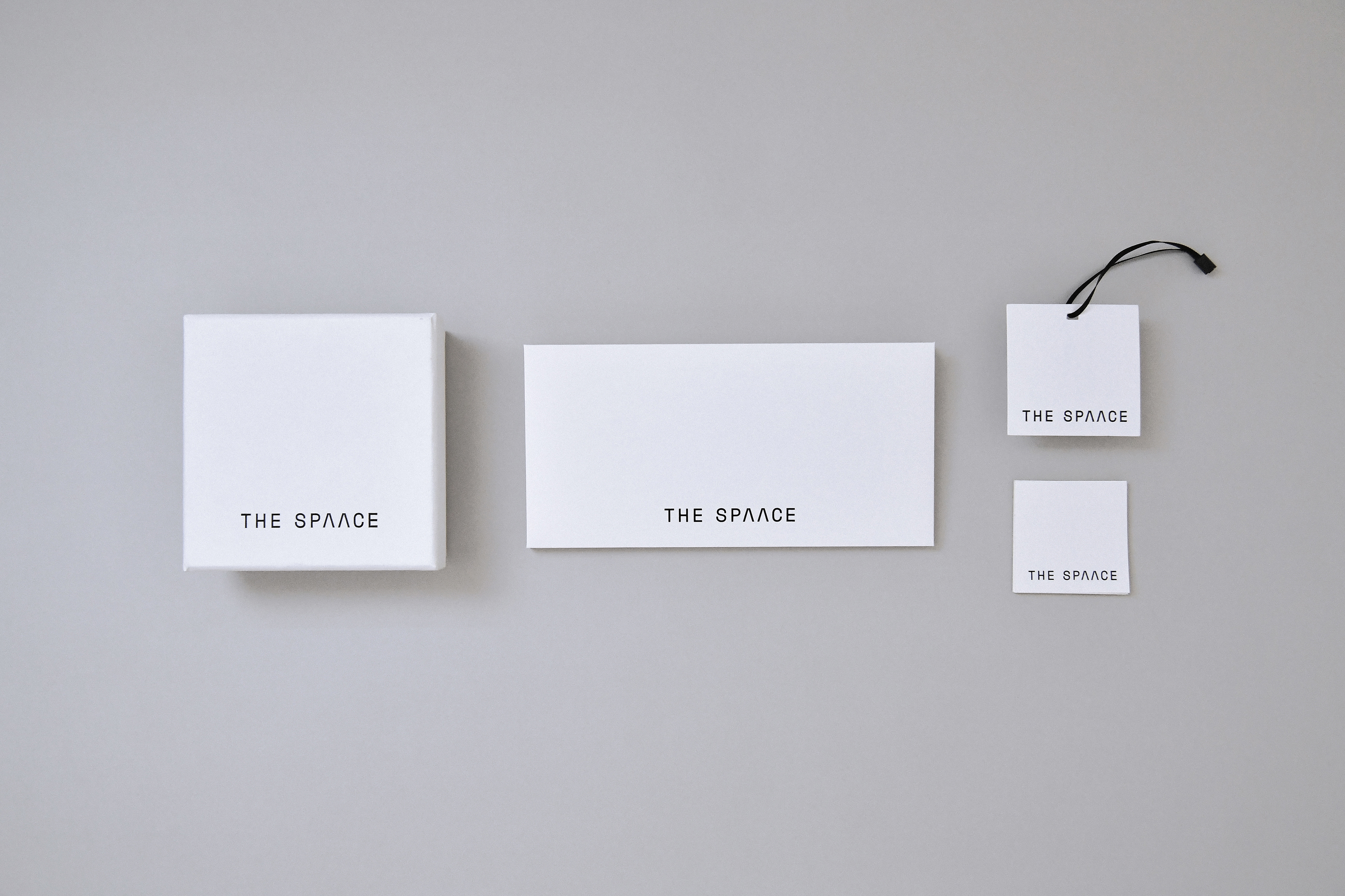
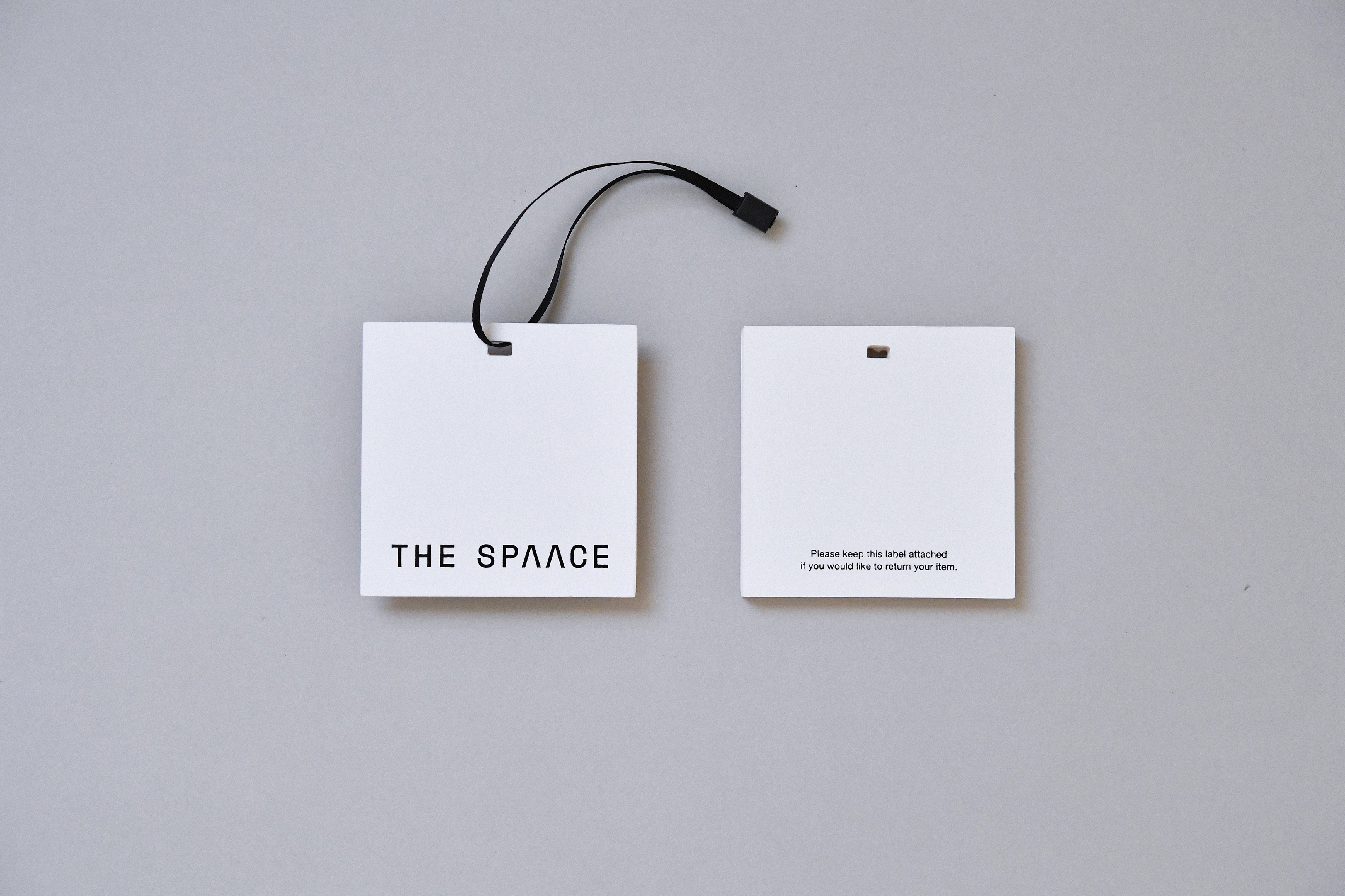
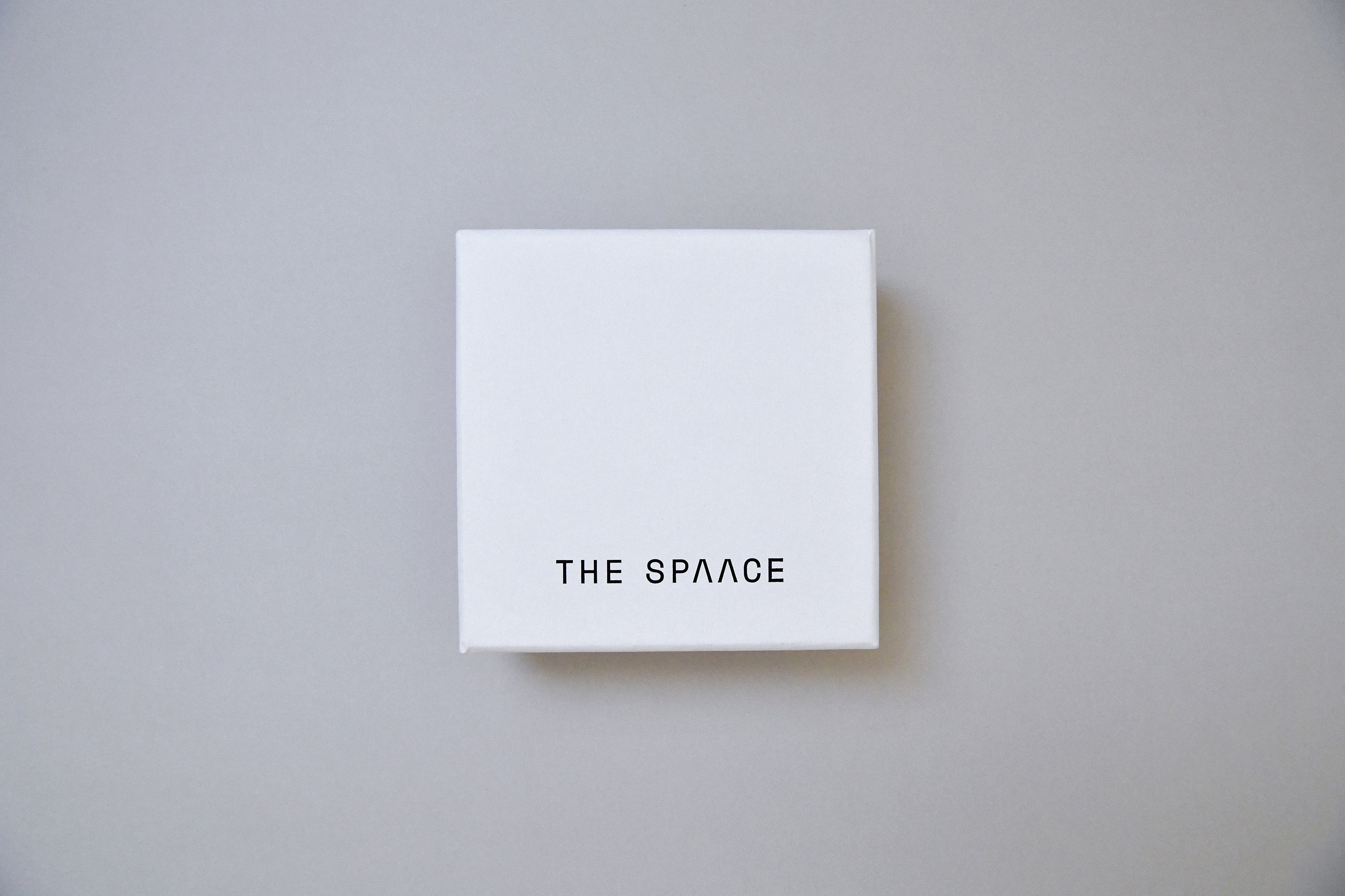
包裝設計包括一系列的紙箱、吊牌、發票信封、包裝紙、珠寶盒。延續簡潔的風格,材質與顏色的選用都以中性的白、黑、或是材質本身的原色去表達簡約卻帶有溫度的感受。包裝紙的部分,特別設計一個以LOGO作重複延伸的圖案。
將新的品牌識別引入線上平台時,我們選擇了一種簡化、自信的呈現方式,專注於平台豐富的產品選擇與功能性,同時傳達對於視覺呈現的一致性。